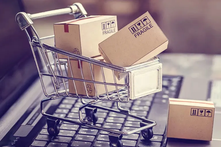
Store sites are in fact a real store on the web, which has all the standards of a store, including a storefront, seller, cash register, and even an exit gate.
Designing a store website is actually setting up a real store that is active on the web. These online stores must have the atmosphere of a real store and appear victorious in the competition with face-to-face sales with the options they provide.
It seems that business in the internet world has overtaken the real world and has attracted many fans these days. Even girls don’t show the desire to shop in person and visit shopping malls like in the past. Therefore, store sites are especially important.
In order to have a flawless store website design, we share some important points with you. Most of these things increase the customer’s sense of trust towards your site. Many common mistakes in website design can jeopardize your online market. By observing these things, the conversion rate of your store site will increase and your business will move forward.
Important features of the store site
A store website should have many features and facilities, and below I have tried to address the most important and main features of a store website and review them in general.
1- Determining the goal
First of all, the purpose of your site should be clear.
- What are you going to sell?
- What is the sales process until delivery to the customer?
- Do you have discounts on products and goods? Always or sometimes?
And there are many things similar to this Chinese that you should know and implement while designing the website . Your goal should be easy for the audience to understand so that they can decide how to buy based on it.
2- Attractive and creative
The face and appearance of the site is the first thing that every user encounters. The visual appeal of the site is the first step to attract the audience. If the face of your site is not beautiful and attractive or looks too messy and ugly, the audience will not trust its content. Of course, this may not be important for some customers, but an attractive showcase will encourage them to buy more. Don’t forget that customers are first attracted to the storefront and then spend money.
In designing an attractive website, the role of colors and its impact on the audience is very important. You should also take the quality of the images seriously.
This does not mean to create a busy site with different effects. Sometimes simplicity can be very attractive. So let’s try not to have a cluttered design for a store website.
3- Standard SEO
SEO is the most important thing to be seen better. Basic SEO is like having a three-corner store in the best part of the city. Improving your online store depends on better optimization. The better your site’s SEO is, the more users you will see in the first rank of search results. Users trust more sites that are among the first ranks of search engines . If you can attract the trust of the audience, the traffic of your site will increase. The better you implement the principles and rules of store website design and SEO, the more you will increase the conversion rate of the audience into customers.
4- Responsive design
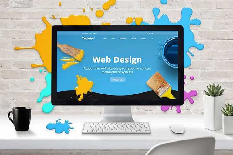
Responsive website design is one of the processes that must be done during website design. However, this work is not only for store site design experts and it is mandatory for all sites. Responsive design allows users to easily see all the components of the site and easily access all sections with any type of digital communication device such as mobile phones, tablets, computers, etc. Especially since more than 70% of internet users use internet services with mobile phones. Non-responsiveness may hide a part of the page from the audience. A visitor who does not find his answer within a few seconds, leaves the site easily. Whereas if he finds his needs easily, he will spend more time on your site.
5- Basic arrangement
You have definitely seen how much the stores spend for a stylish, attractive and customer-friendly showcase and they are looking for innovation. Some stores even hire an interior designer to have a so-called fantastic showcase. Because they know that attractiveness and innovation create customers. If your store is an online store , how do you arrange the website window to attract customers?
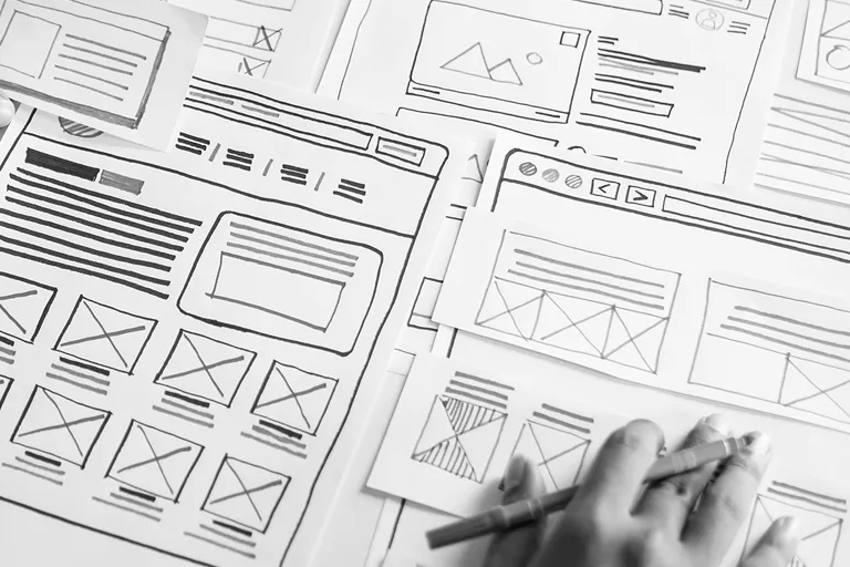
In the design of the store website, arrange your showcase in such a way that the product variety is felt well and the audience does not get bored.
Shelves and categorize and guide the audience to get the product they need to get what they want as quickly as possible.
6- Product specifications
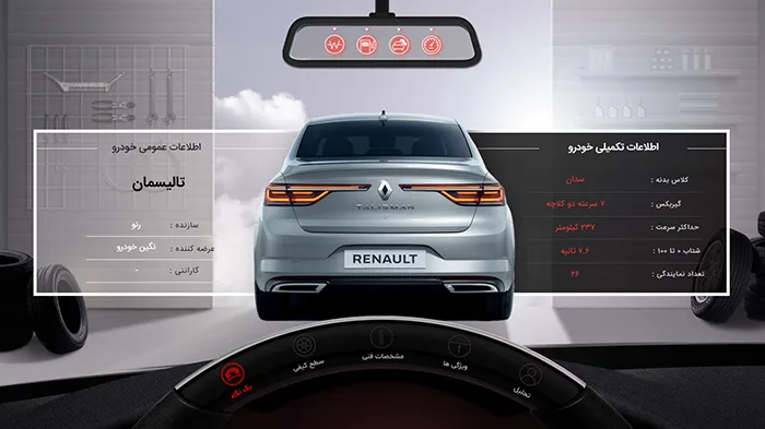
It doesn’t matter what product you have for sale. Clothing or tools or even vehicles. Whatever you sell, you should include a brief and technical description for it. Do not forget that you do not make eye contact with the audience. You don’t even have a verbal relationship. Customers of online stores are looking for results in a fraction of a second and are not very willing to explore. On the other hand, if they do not have the necessary information about a product, they will not buy. Therefore, you do not have a chance to satisfy the audience and advertise . The best way is to tell the specifications of the desired product next to the product photo. Try to make the description clear and concise so that the audience can easily recognize the product. You can even have a section to compare this product with other similar products to complete the task.
7- Clear price
Clearly mention the price of each product. I even suggest to write in an attractive and large color so that it is not hidden from the eyes of the audience. We must admit that price plays an important role in the purchase decision and is important to many audiences.
Even if you don’t want to register the price according to the site’s policies, clearly mention how to get the price of the product. For example, call us to get the price.
8- Related suggestions
You can introduce related products, similar products and your offers on each showcase page. You must have seen some people who visit a store only ask for the price. They reject some products and end up not buying and leaving. Sometimes, some of these aimless customers are unknowingly encouraged to buy another product by the seller’s suggestions. This story is also true in online stores. However, you must create this section during the design of the store site. Some of the audience are just browsing through the pages of your site and may be doodling to make a purchase or browsing the pages as an aimless audience. Your offer may encourage many of them to make a purchase that they had not considered at all.
This will reveal many products that were overlooked by targeted customers and increase your conversion rate.
9- Entry and registration
The registration and login section is an important section that should not be ignored in websites, especially store website design. In this way, the customer becomes a member of your store and considers himself a committed customer. Customer adherence and loyalty will be much higher with registration and membership in your online store. In the registration and login section, customers must create an account with a login password. This will increase the security of their purchase and you will better identify your loyal and regular customers and you can even have a special offer for them. Their contact information and financial information remains safe and you can even send them new product catalogs or new festival dates.
10- Shopping cart
When you specify a shopping cart for the user, the customer will see the product that he has selected and entered into the shopping cart. Also, if necessary, he can go to his shopping cart and check the list of items he bought so that nothing is missed.
Tip: Be sure to have the option to add or subtract from the shopping cart while designing the store website. This gives more confidence to the customer. In addition, if there is a mistake in the selection, he can correct his purchase.
11- Payment page
The ability to connect to the bank portal and pay online is an exciting part for the site manager. At the same time, it makes the buying process easier for the audience. No customer likes to shop online but have to pay in person. This practically calls into question the nature of online shopping. So don’t forget the payment section. However, some site managers have planned an option for the customer to pay the amount to the delivery person during the delivery. Even if you consider this option, specify it on the site for the audience.
12- Transportation
Specify the time and method of shipping and delivery of goods for your audience. It is the customer’s right to know when and how the product he paid for will be delivered to him.
13- Security
Technical SEO is a part of the site design process , and site security against hacker attacks and other risks is done in this section. Site security is very important, especially in store site design, and even vital for your business credibility. Users and customers have trusted your site and registered their personal information and bank card information. If your site does not have enough security, a hacker can easily steal this information and empty the bank account of customers or have similar abuses. It can also compromise the security and shipping process of the site by deleting some information.
14- Advanced search
The search bar or search section allows the audience to easily search for a product if they do not find it among the pages and access their needs sooner. I remind you that the customers of the Internet world have no interest in spending time and searching. Everything should be ready in a fraction of a second.
This is the most important point in designing a store website.
15- Contact information and history
About us page introduces you to the audience. It proves your work history so that the audience knows you better. As a result, he trusts you and your online store more easily.
A contact us page tells the audience to reach you if necessary.
16- Frequently asked questions
This section is an interesting technique for explaining questions that generally arise for most of the audience. The frequently asked questions section solves many of the doubts of the customers. Without spending a lot of time or having to contact you.
17- The possibility of conversation
If you plan to design a store website, be sure to create a chat room section so that the audience can access the site operator and ask their possible questions. Many audiences are eager to buy goods after chatting with the operator.
18- Rating products
This section is an attractive section for customers. Many customers feel empowered by being asked for their opinion. Also, your site is introduced as a customer-oriented site. Other audiences also trust the desired product and buy it according to other people’s opinions, and the probability of their purchase increases.


