Website design has come a long way since the first site was released in 1991. With more than a billion active websites on the Internet today, it’s no surprise that the industry is growing and developing even more. We at DigiDing use the ability of the best web design experts, enthusiasts and designers who follow this field to develop new technologies. So, if you are here to learn more about the world of web design, you have come to the right place.
In this article, as an introduction to learning how to design a website, I am going to provide you with a basic and specialized understanding of this field by defining important terms and topics.
What is website design?
Website design is the art of planning and arranging content on a web page in such a way that it can be shared online with the world and accessed from anywhere in the world. Web design is actually a type of digital design that determines the appearance structure of a website and creates its user interface by combining various aesthetic and functional elements such as colors, fonts and images.
Today, having a website is considered one of the main pillars for entering digital markets and online spaces. Because of this, the world of web design is dynamic and constantly evolving, from mobile apps and user interface design to meet the growing needs of website owners and visitors.
Web design is a hybrid process that combines knowledge and tools from related fields, from website design statistics to SEO and UX .
Web designers are often professionals who have sufficient knowledge and experience in various fields of design and programming and can create specific outputs by focusing and optimizing performance on various processes.
The difference between website design and website development?
The first step in your website design journey is to define the difference between web design and website development, as these two topics are closely related and are often mistakenly used interchangeably:
Web design refers to the visual design and aspects related to the user experience in a particular website, but website development refers to the basic construction and maintenance of the structure of a website and includes complex coding systems that use programming languages Various guarantees the correct functioning of the website .
Some website development languages
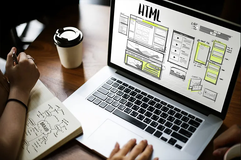
HTML or Hypertext Markup Language is a programming language that is used to design the front part of websites or the user interface. This language actually creates the structure of a web page and is compiled by web browsers and the output is displayed in the way we see a website.
CSS or Cascading Style Sheets is a programming language that contains all the information related to the formatting and styling of web pages. CSS is combined with HTML to create and design the style and formatting of a website or a page, such as layout, fonts, spacing, colors, and more.
However, if you use a CMS or a content management system, which is a computer software for managing the digital content of a website, to design a website, you can learn how to create a website with various tutorials on the Internet. Build the website and update it without using or knowing coding knowledge. WordPress is a powerful example of these CMSs, which acts as a user-friendly system for developing website content, without the need for programming knowledge.
Web design tools
Web designers need a unique set of tools to create and design a site. Meanwhile, a few key elements determine which of these tools they will use and at what stage they will need them.
To determine these tools, you should first answer a few questions so that you can choose the best tools and infrastructure for your website design: How big is your team? What budget do you have? What kind of technical requirements does your site need? What is the overall graphic design you want to achieve? Will you be creating an interactive or responsive design? What is the purpose of your website? The answers to these questions will help you understand what kind of infrastructure and software tools you want to start with.
Content management systems like WordPress are great for designing many websites because they don’t require coding, and with a wide range of ready-made templates for any industry, they make your work much easier, and graphic design tools like Figma , Photoshop , and Sketch . You can also use it to create wireframes , build custom features, and other design elements.
As you gain more experience and use a wide range of web design tools, you’ll find out which one is right for you and your different business needs.
Principles of website design
One of the first parts to understand the concept of website design is to know the principles and standards of web design and how to use them.
Applying basic visual features and combining them together in web design helps web designers to have a site with a harmonious appearance and structure.
The principles of design are actually the basic blocks that form the main structure and foundation of any creative work. These principles will help you to make a correct and standard decision about the arrangement, style and structure of elements and the type and method of using different colors and elements.
The reason for using these principles is to ensure that the design result is both visually appealing and effective in expressing the intended design goals, in order to best provide the basic framework for success.
Of course, these principles are not strict and complicated rules and standards that are difficult to follow, but rather guidelines for how to use different elements in the basic design of a website.
I suggest you learn the rules like a pro, so you can break them like an artist. Once you understand the goals of web design and become familiar with the various elements of a website, you can change your approach by offering more creative designs with attractive website design .
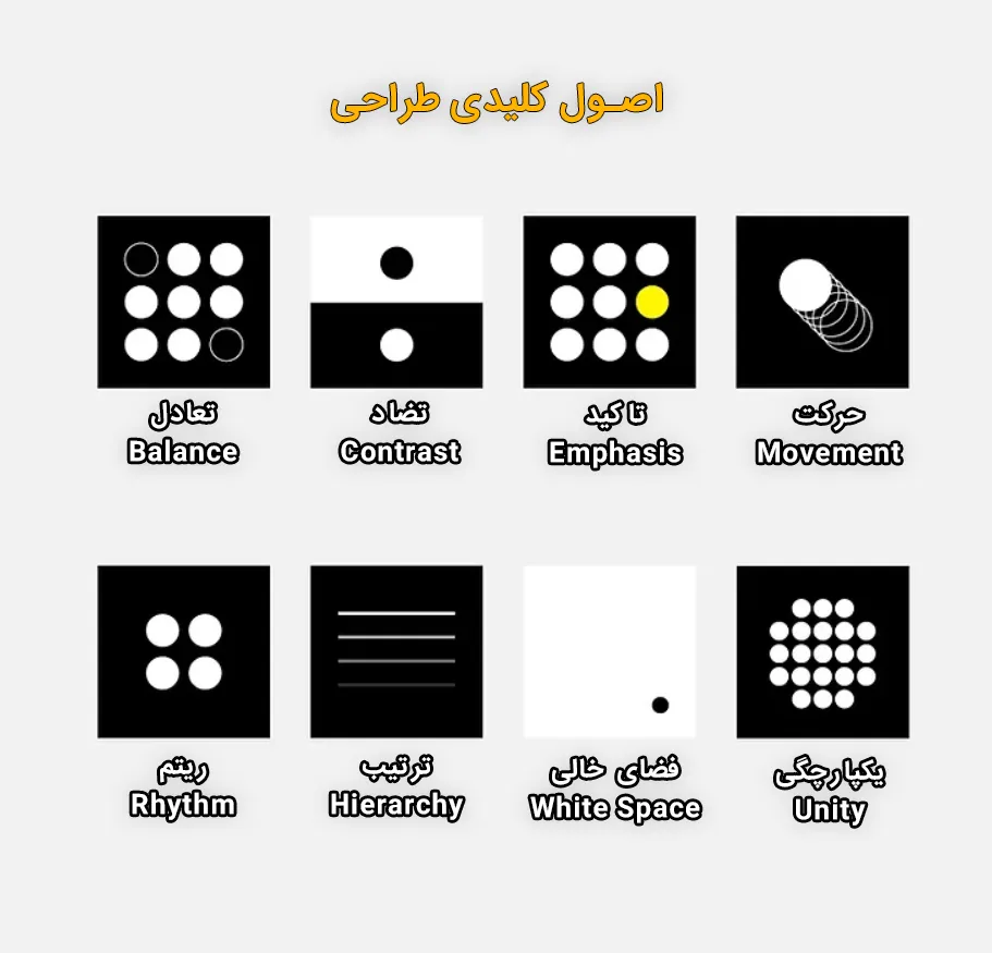
In the following, we examine some of these principles together:
- Balance
- Contrast
- Emphasis
- Movement
- rhythm
- Hierarchy
- White Space
- Unity
Balance
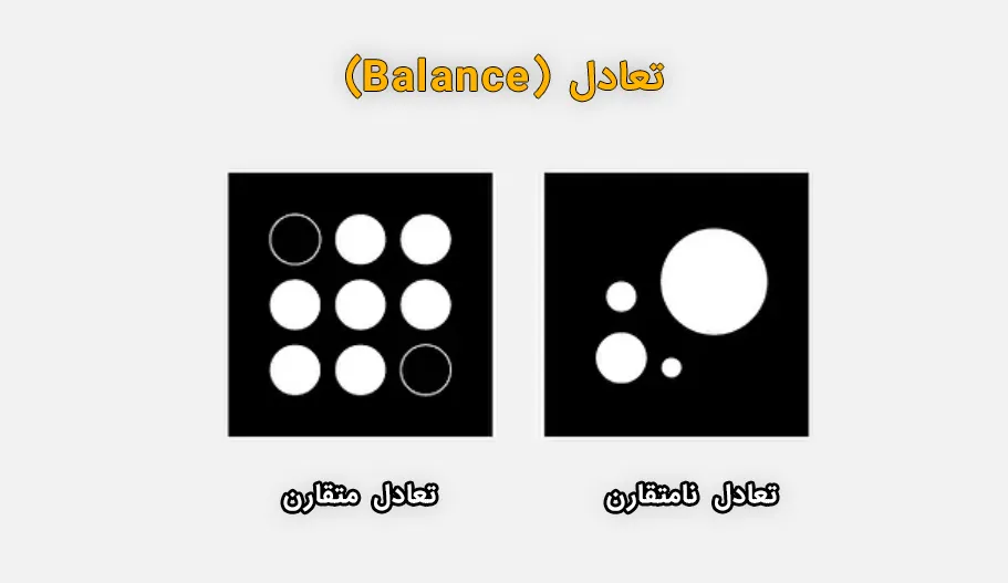
Visual balance means making sure that no one design element in a composition is too powerful than the other elements. In web design, you can apply this by drawing an imaginary line in the center of the page and arranging the elements in such a way that the visual weight is equal on both sides.
There are two main ways to achieve balance in website design:
- Symmetrical balance: In this method, the visual weight should be equal on both sides of the line and all elements should be arranged like a mirror image. When you use this method in web design, you can evoke a sense of balance and beauty in users.
- Asymmetrical balance: In this method, the visual weight should be equal on both sides, but the composition and order of the elements should be different, which means that the created image no longer has a mirror structure. Asymmetric design is a modern approach in website design that creates a more dynamic experience for the viewer by maintaining a harmonious composition and order.
Contrast
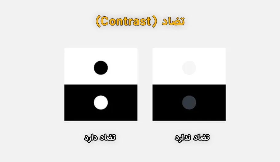
Contrast refers to the arrangement of elements together in such a way that their differences stand out from each other: dark and light, calm and rough, large and small. When you use the principles of contrast in your designs, you actually create dramatic and exciting features that will captivate your visitors as they visit your site.
Emphasis
The principle of emphasis reminds us that not all elements of our website are created equal, and it doesn’t matter if this element is your logo or a CTA button or even an image; If there is an element on your website page that you want visitors to pay attention to before they see other parts, you need to make sure that you emphasize it by using light or dark colors, animation, and different sizes. You have assigned to that element and separated that element from other sections.

Movement
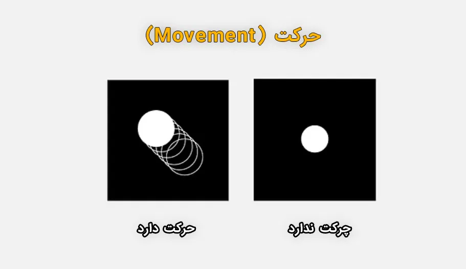
Movement is an important feature that, when applied in web design, guides visitors from one element to the next. By controlling the size, direction and order of elements in the composition of different elements of a web page, you can direct the user’s eye movement path as you want throughout your website.
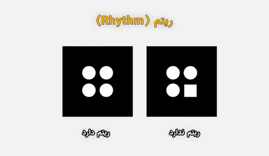
rhythm
In fact, the use of rhythm principles refers to the repetition of elements in order to create stability, coherence or strengthen a specific message. Repetition of elements such as logos, brand colors, complementary colors, and using the same typefaces and pictograms will strengthen your brand identity and presence across the web and digital world.
Hierarchy
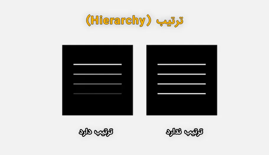
Putting the name of a business at the end of the home page is one of the examples of not respecting the order of elements in web design. Can you guess why? Because the visitors who visit the site for the first time have to go all the way to the end of the site to finally know who you are. Our understanding and experience of the principle of hierarchy teaches us that the most important content should be placed in a prominent and accessible place where visitors can immediately see and interact with it.
White Space
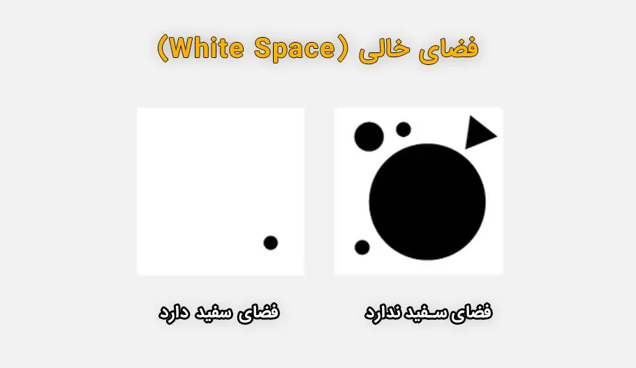
In art and design, any part of a composition that lacks visual elements is called white space, even when it is not actually white. At first glance, you may not realize the importance of white spaces, but remember that the conscious arrangement of white spaces in website design allows the various visual elements of your web page to breathe and be seen. It can also help to achieve other goals such as order, balance, emphasis and others.
Unity
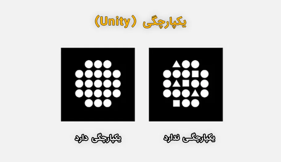
Integration in the design of different parts indicates the existence of harmony among each and every element that you have added to your site, ideally this harmony and so-called integrated design system leads to a harmonious combination between all the elements and your design. represents as a professional design.
The goal of consistency in the design of various website elements is to ensure that your site visitors are not affected by a lack of coordination and are not confused on their journey through your site. If your design does not benefit from an integrated design system, it will eventually cause users to move away and not want to continue visiting your site.
You may struggle to come up with a purposeful and cohesive design, but once you achieve a cohesive design, you can ensure that every aspect of your site plays a valuable role in its performance. Considerations such as what elements you use, where and how you place them, and whether or not you actually serve a purpose are all important in designing an integrated design system .
Website layout
Planning to create a website layout actually includes setting the structure and determining the type of website design, because this layout determines the order of visual elements on each page of the website. This step in designing the visual appearance of the site is considered a vital and effective part that determines the usability and the type of reinforcement of the site’s message.
The best layouts for the website can be measured and determined by various factors. Of course, there is no general solution or suitable method for everyone, but considering the goals of the website, the message it conveys to users, and the type of content it contains, you can choose the best path by choosing one of the two methods. Determine below and proceed.
Layout according to content
The layout you choose should be tailored to the type of content on your website. For example, if you are looking to design a website where you want to display your products, it is better to go for a design that gives you enough space to highlight the product images. And on the other hand, to design the user interface of a blog you need a proper structure to convey new information in an organized way.
Common layouts
Using previously designed and tested website layouts can also be an efficient method because these designs usually create a sense of familiarity for users, and their structure is based on their expectations or past experiences from other websites. is. So since this type of design may lead to a simple and easy user interface, it can be great for beginners.
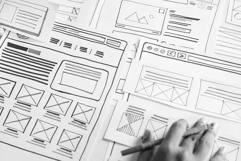
When designing a website, you can use a variety of website templates that come from a wide range of categories to suit all types of businesses, to provide a solid foundation for your site layout. If you want to design a design from scratch, I recommend using a wireframe to start. Using the wireframe process allows you to draft your website layout before implementing it.
Functional components of web design
The quality and strength of the website is basically determined by examining how your website performs. Everything from website speed and ease of access to various components to specific actions that can be taken on the site are measured and reviewed to determine the quality of a website.
When I think about how much faster and more efficient websites are today than they were 20 years ago, I’m reminded that we’ve come a long way, and given the advancements in the web design industry, it’s in our best interest to keep up. We use today’s modern tools to ensure the proper functioning of our websites.
Let’s look at the 5 main areas in web design that directly affect the performance of your site:
- Navigation menu
- Speed
- SEO
- User Experience (UX)
- Responsive Design
1- Navigation menu
A site can consist of several pages and various other items for visitors to view or use. Website navigation menu is an important part of website design that allows visitors to find the web pages they need easily and as quickly as possible after entering the site.
Adding a professional and functional navigation menu to your design is the best way to provide a quick and easy way for users to reach your important and desired pages. The menu of a website is linked to several important sections on your site and by helping the user navigate between pages and sections, it plays a key role in providing appropriate services to your users and audience.
Depending on the type of website design, you may choose one of the following menus:
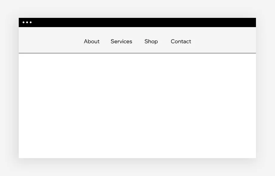
Classic menu
It is one of the popular menus in the design of different websites, which is placed in the header of the website and is designed as a horizontal list.
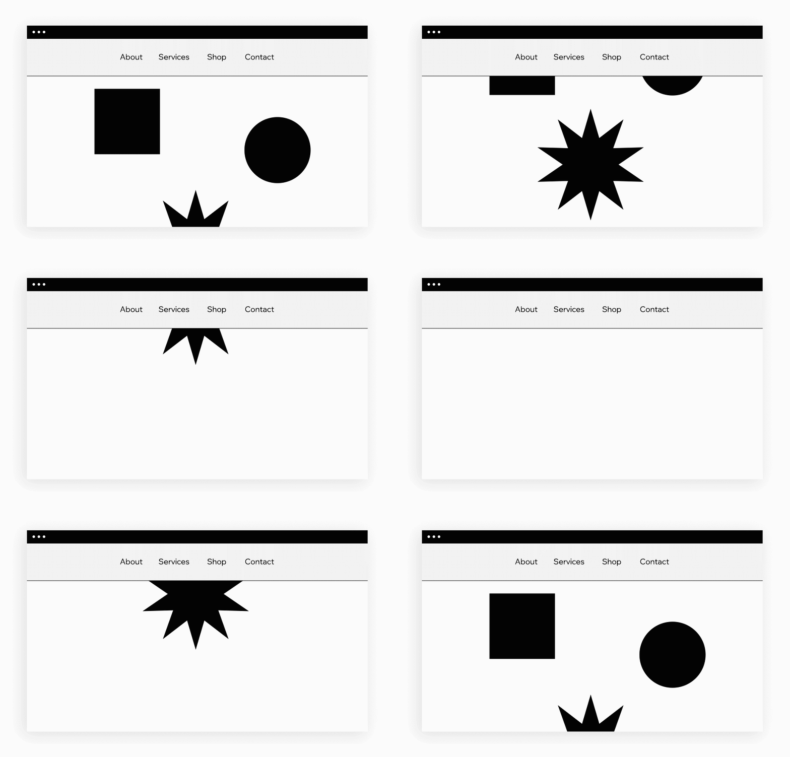
Sticky menu
Also known as a static or floating menu, this menu remains in place when site visitors scroll down the page.
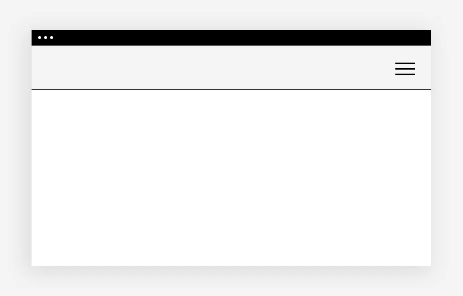
Burger menu
It is a symbol that usually consists of three horizontal bars, after clicking on which a full menu opens for the user.
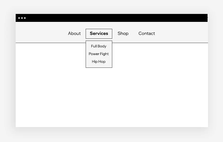
drop down menu
A menu containing a list of each item’s sub-categories opens when the user clicks on it or hovers over it.
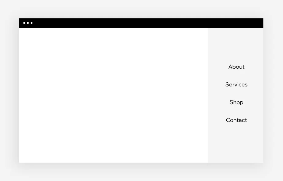
Vertical menu
In this type of menu, a list of menu items are placed vertically on the left or right side of a web page.
2- Speed
The full loading speed of the site after the visitor enters it is one of the important and influential factors in determining the quality and efficiency of a site. No one likes a slow website, especially in our fast-paced world. A site should be displayed as quickly as possible and at high speed. In fact, studies show that when the loading time of a web page exceeds 3 seconds, the bounce rate, which is the user’s abandonment of the site, increases by at least 38%. It doesn’t matter how beautiful the website design is, and what functional parts and elements you have used on your website, unless you can provide a fast and easy browsing experience for your visitors, you cannot compete with other sites.
Many factors can affect the load time of a page. Some of them are related to the type of device or the quality of the visitor’s own Internet connection, while other of these factors may be specific to the website that users want to browse. Today, there are many specialized methods and tools such as GTmetrix or Lighthouse to check site performance and improve page loading speed. I recommend you start working with these tools and learn how to use them.
3- SEO
SEO or optimization for search engines is the process of optimizing the structure and pages of a website for the correct understanding of the content and contents of the site by search engines, which is done in order to get a higher rank in the search engine results pages (SERP). Since visibility in search results pages plays a big role in the success of websites, I think it is appropriate to mention SEO in this article along with the elements that affect the site’s performance. The more people who can find you on Google, the more visitors will use your website.
SEO is a specialized and continuous work, web designers must master this knowledge in order to integrate website design with SEO principles and standards in order to create a fundamental structure and basic SEO for different pages of the site from the very beginning of the design. This knowledge is placed in the field of On pagel SEO of the site and guarantees the positive and standard performance of the site. Of course, Off Page SEO and technical SEO are other parts of SEO services , which are among the abilities required by SEOs, and there is no obligation for web designers to be familiar with these specialties.
There are specialized and common things in the field of internal SEO that must be done before publishing the website pages in the Internet world. For example, you should use the correct and hierarchical structure of the titles in the content of the pages, or add the alternative text and the same ALT tag to the images on the pages, or put the meta description on the relevant pages, and of course choose a domain that represents the brand. or your business.
All these things and more than 200 other factors are effective in optimizing the pages of a website for search engines, and by giving importance to these principles and doing them, success in the digital world is guaranteed.
4- User experience (UX)
Since the rise of computer use in the 1980s, the technology industry has been constantly exploring how humans interact with technology. Optimizing the user experience while on the website is known as the science of UX, which if properly applied in web design, can have an amazing impact on the user journey.
The term UX is often mistakenly used instead of the concept of user interface design, but in fact it can be said that UX is part of a much larger landscape in which designers in this field pay attention to the various aspects of a product that affect the state and emotions of the user. have, they are also engaged in looking at the bigger picture of the user interface; and are focused on finding solutions to complement and develop products, branding, design, usability and performance optimization.
Using the UX design process is important and effective because in this process, by taking specialized measures, it is ensured that a website is moving and optimal in terms of interactions, content, products and quality services, in order to improve the following seven factors. becoming:
-
Be useful
-
Usability
-
to be understood
-
Be reliable
-
Being of quality
-
Availability
-
to be valuable
5- Responsive Design
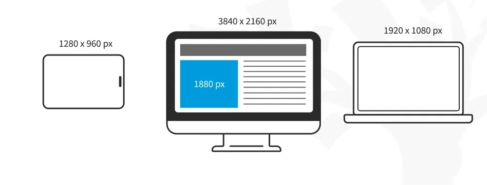
Today, mobile devices account for more than half of online web traffic, and for this reason, it has become very important for websites to be compatible with the small screens of mobile screens. There are two types of styles that make it possible to change web design from desktop to mobile: interactive design and responsive design . Knowing the difference between the two will be very useful for web designers when choosing a web design infrastructure, as most platforms only support one of the two:
Interactive design
Interactive design involves creating different versions of a website, each of which can adapt to the appropriate screen size or browser width. In this way, designers can create a different structure for the desktop version of their site, and implement a completely separate and adjustable design of the website for mobile phones.
Responsive design
Responsive design involves creating websites with a single and flexible grid. In this method, only one version of the site is created, and the website reactively arranges and creates the elements and elements on the page with a dynamic appearance for viewing according to the screen size of the user’s device.
Visual elements of web design
The visual elements of a website are just as important as its functional features, and of course they are the elements that work together to shape the overall look and feel. These elements, from color schemes to fonts and video, and all the details, play a role in your user experience and branding . In an age where people no longer have the desire and patience to read long texts, it is important to ensure that target users like the visual elements used in website design.
Next, we will examine the visual elements of web design, focusing on several important points for making the right decision in accordance with aesthetic principles:
- Header
- footer
- Colors
- typography
- background
- Pictures
- Animation
Header
The website header refers to the top part of the website page and is the first thing visitors see when they enter a site. In such a strategic place, the header is basically used to display the navigation menu, brand name, logo or contact information.
footer
The website footer is located at the bottom of the page and is mostly fixed on all pages of the site. Since this section is the last thing visitors see, it’s a good place to add and repeat important information without requiring too many visual elements. The footer is also a common place to include contact details, a map, sign-up form or social media buttons.
Colors
When it comes to web design, the color scheme of your website sets the tone of your site. Strategic use of a particular color scheme can play a key role in strengthening brand names.
When determining your site’s color scheme, you first need to decide which colors will be your main color, or indeed the dominant color on your site, and which colors will include secondary colors that are used consistently, and Finally, specify the accent colors that should be used in smart ways to highlight specific details of the site.
typography
Typography refers to the visual aspects of texts, and the selection of fonts and the arrangement of texts, which includes an important part of web design. Typography can be used to complement the aesthetic style of a website or to emphasize and reinforce written messages throughout a site.
When choosing a font for your website, consider the fact that typography can be just as important as the words themselves. You should choose fonts that are legible, appropriate for the theme of the site, and most importantly, appropriate for your brand. Similar to the colors section, in typography, you should choose the main, secondary and accent fonts so that the way the visitor experiences your written content is determined.
background
Website background plays an important role in web design. Regardless of whether the background of the pages is static or animated, simple or patterned, it is the element that constantly follows visitors on their journey.
You can use any image or video for the background of the website, use the brand color , go for a gradient or modern background or choose a minimalistic theme and leave it white. Whichever of these designs you decide to use, you must first make sure that it matches the overall visual theme of your site and attracts the attention of visitors without creating distractions.
One way to add more excitement to the background is to implement scrolling effects, such as parallax, which are also popular with web designers.
Pictures
Website images can reinforce and convey the message you intend to send to your visitors in just a few seconds. One of the reasons for the high importance of images is that the message that a single image can convey to the user at a glance may not be able to be conveyed with several pages of text. Therefore, images may be used to display products or the location of a business. Images of an event, or the use of different icons and pictograms can be used to add a little interest to the site design .
Animation
One of the goals of web design is to differentiate from other competitors. Adding animation to a website is a great way to do this differentiation and can greatly contribute to the positive experience and performance of your users. By placing various animations throughout the site, you can create a more dynamic experience and specific reactions for viewers. You can use various animation features in the following cases:
- Create a CTA button to encourage visitors to click
- Create elements such as guides to show the route to users
- Use in the loader to make the waiting time more exciting
- Things that users should pay attention to, such as the lightbox for registration
Website design steps
In general, website design work is done in 6 steps, if these steps are followed, a website designer can complete a successful project, which we will discuss below:
researches
Collect information to understand more about the customer’s business
planning
Site design path and coordination with the client regarding site content
Designing
Shaping and creating the appearance of the overall site template with main elements
Programming
A programmatic site design to be displayed by browsers
Implementation
The steps of implementing and raising the site in addition to the hardware requirements
Repair and maintenance
Site support and troubleshooting and site security
Classification of types of website design
Different categories may be used for the design structure of the sites, which are defined according to the nature of the site. In the following, I will introduce 6 commonly used and basic categories that are divided based on the desired industry of the sites.
-
Store website design
-
Corporate website design
-
Service website design
-
Educational website design
-
News website design
-
Personal website design
Characteristics of a successful site
To design a website according to the type and industry of the site, various features are implemented, these features may be different in each of the types of sites, but in general, a successful site must have 9 main features regardless of the type of site. It has given itself space to reach its desired growth and development in digital markets.
- Having a logical and basic roadmap
- Dissemination of correct and business-related information
- Provide appropriate business contact information
- Having a simple and attractive user interface
- Ensuring the security of the site and users
- Insert links of social networks
- Mobile access
- Answers to frequently asked questions of users
- Allocate a good hosting space
Website maintenance
The web design industry is constantly introducing new features, tools and solutions. One of the negative aspects of the digital world is that it changes rapidly, which is why you must always be up-to-date and implement a maintenance plan for your website.
After completing your design, you should finally update your website to ensure that your content is relevant to your business and that your design is not outdated. It may not seem obvious or trivial, but any outdated element on a website can have a negative impact on visitor interactions and, as a result, reduce overall performance.
Visit your website at least once a month to make sure there are no bugs, everything is working properly, and your information is up to date.
When you decide to redesign, you can make changes to make it more relevant, improve usability, or enhance its functionality, which may mean adding fresh visual content, an extra page, working on SEO, or doing things related to Easier access.
Ideation in web design
Now that you are thoroughly familiar with the basics of web design, it’s time to look for creative examples. Web design ideas are everywhere, but I recommend checking out sites like Behance , Awwwards , and Pinterest regularly for new ideas.
Professional website designers are constantly looking for the best websites created by different people and creative website owners to take a valuable step towards personal development and increasing their expertise by taking inspiration from their ideas. I also advise you not to waste time and start following people or collections whose portfolios you like and think are influential in your development.
